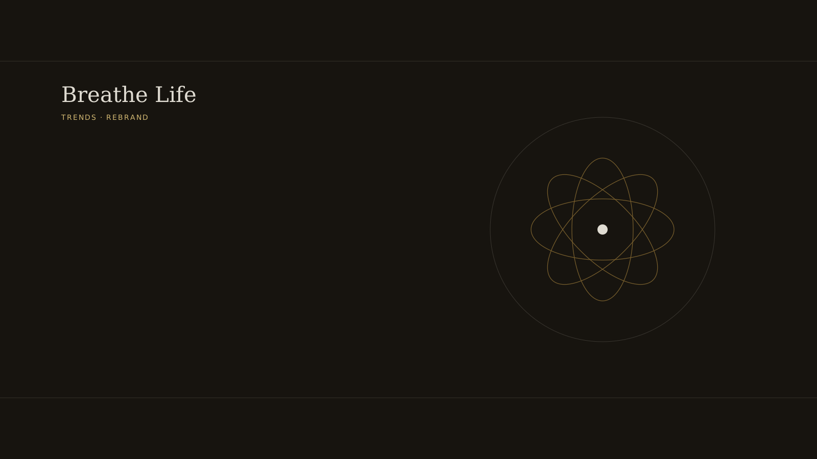
Nat Habit has moved on from “Fresh Ayurveda,” the positioning that built it, to a new identity called “Breathe Life” - a new chakra-inspired flower mark replacing the old calendar icon, a cleaner color system, and actor Sahher Bambba signed on as the face of the relaunch. The rollout lands across digital, quick commerce, and retail through October. It arrives with the brand nearing Rs 250 crore in revenue and past 10,000 stores, with close to 40% of that revenue now coming from smaller towns rather than the metros the “fresh, homemade Ayurveda” story was originally built to sell in.
That last detail is the one most coverage will treat as a footnote. It’s the actual strategic problem the rebrand has to solve.
The bet most rebrands don’t have to make
A brand that grew up on “fresh Ayurveda made like your grandmother’s kitchen” has a positioning that scales beautifully to a certain buyer and stops scaling the moment that buyer isn’t the growth engine anymore. Nat Habit’s own numbers say the growth engine has shifted - smaller towns, a broader shelf, a demographic the brand is now explicitly naming as 25-to-35-year-old women rather than letting the “homemade” framing define the audience by implication. A celebrity face and a sleeker mark are the visible part of that shift. The harder part, invisible in a press photo, is whether the brand can carry a more universal promise - vitality, “breathing life into beauty” - into towns where the old promise of kitchen-made freshness may have been doing real work with a different audience than the one the company is now building for.
Why this is a harder rebrand than it looks
Most legacy rebrands fail by touching the thing customers were actually loyal to and leaving the actual clutter untouched - a pattern InHustler has flagged before. Nat Habit’s risk runs the other way. The company isn’t rescuing a stalled brand; it’s changing the story while the business is still accelerating, which means any confusion the rebrand introduces gets amplified by the same retail expansion that made the rebrand feel necessary in the first place. Ten thousand stores is ten thousand places the old and new identity can collide on a shelf before the transition is finished.
What to actually watch
Not the logo. The logo is a design decision. The number worth tracking a year out is whether that 40% smaller-town revenue share holds or slips as the brand’s face and language shift toward a more urban, more universal aesthetic. A rebrand executed well would grow the metro appeal without quietly telling its highest-growth market it no longer looks like it was made for them. That’s the tension “Breathe Life” has actually signed up to resolve, and it won’t show up in a launch campaign - only in same-store numbers, several quarters from now.