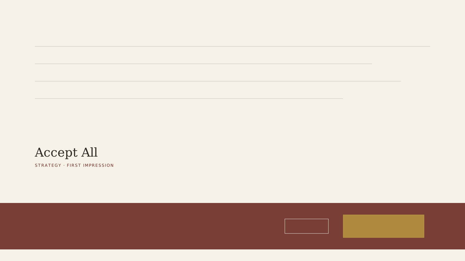
The first interaction most visitors have with a website isn’t the headline, the hero image, or the pricing - it’s a banner asking permission to track them, and almost no company treats that banner as a brand decision. It gets dropped in by whatever consent management tool the legal or compliance stack picked, styled with whatever default colors shipped in the box, and left there because it technically satisfies a regulation.
That is the wrong frame. The banner isn’t a compliance artifact that happens to sit on the page. It is the company’s actual first sentence to every new visitor, and most companies are letting a vendor’s default copy write it.
What the default copy actually says
Out of the box, most consent banners are written to maximize opt-ins, not to be honest: “Accept All” is a large, high-contrast button; “Reject” or “Manage Preferences” is a small gray link buried in the corner, sometimes two clicks deep. A visitor reading that layout for half a second doesn’t register the legal language - they register that the company is nudging them toward the option that serves the company, before a single word of actual content has loaded. That is a strange opening impression for a brand trying to be trusted.
The companies that get this right treat the choice as symmetric
A handful of sites make “Reject” and “Accept” the same size, the same color weight, the same number of clicks - and the ones that do are disproportionately the brands already known for straightforward pricing pages, clear return policies, and plain-language terms. The banner isn’t the reason those brands are trusted. It is a tell that the same instinct runs all the way down to the one component most companies never look at twice.
It costs nothing to fix and almost nobody checks
Changing a consent banner’s button sizes and copy is a design ticket, not a legal rewrite - the regulation usually only requires that both options exist and function, not that one be visually dominant. Most teams never revisit it because it was configured once during a compliance sprint and nobody owns it afterward.
The real cost is paid before the pitch even starts
A visitor who feels nudged in the first three seconds carries a small, usually unconscious skepticism into everything that follows - the pricing page, the testimonials, the “trusted by” logos. None of those get a fair hearing if the company’s literal first move was a soft manipulation dressed as a legal requirement. The fix is cheap. The reason most companies haven’t made it is that almost nobody thinks of the cookie banner as a brand decision at all - which is exactly the point.